

A brand is more than just a name—it’s a reflection of values, vision, and identity. Recently, I unveiled a brand refresh that aligns more closely with the full name of this company: WeCultivate.
While the design process involved plenty of late-night, insomnia-fueled decisions, each element of the new logo was chosen with intention. Every piece represents something meaningful. Here’s what it all means.

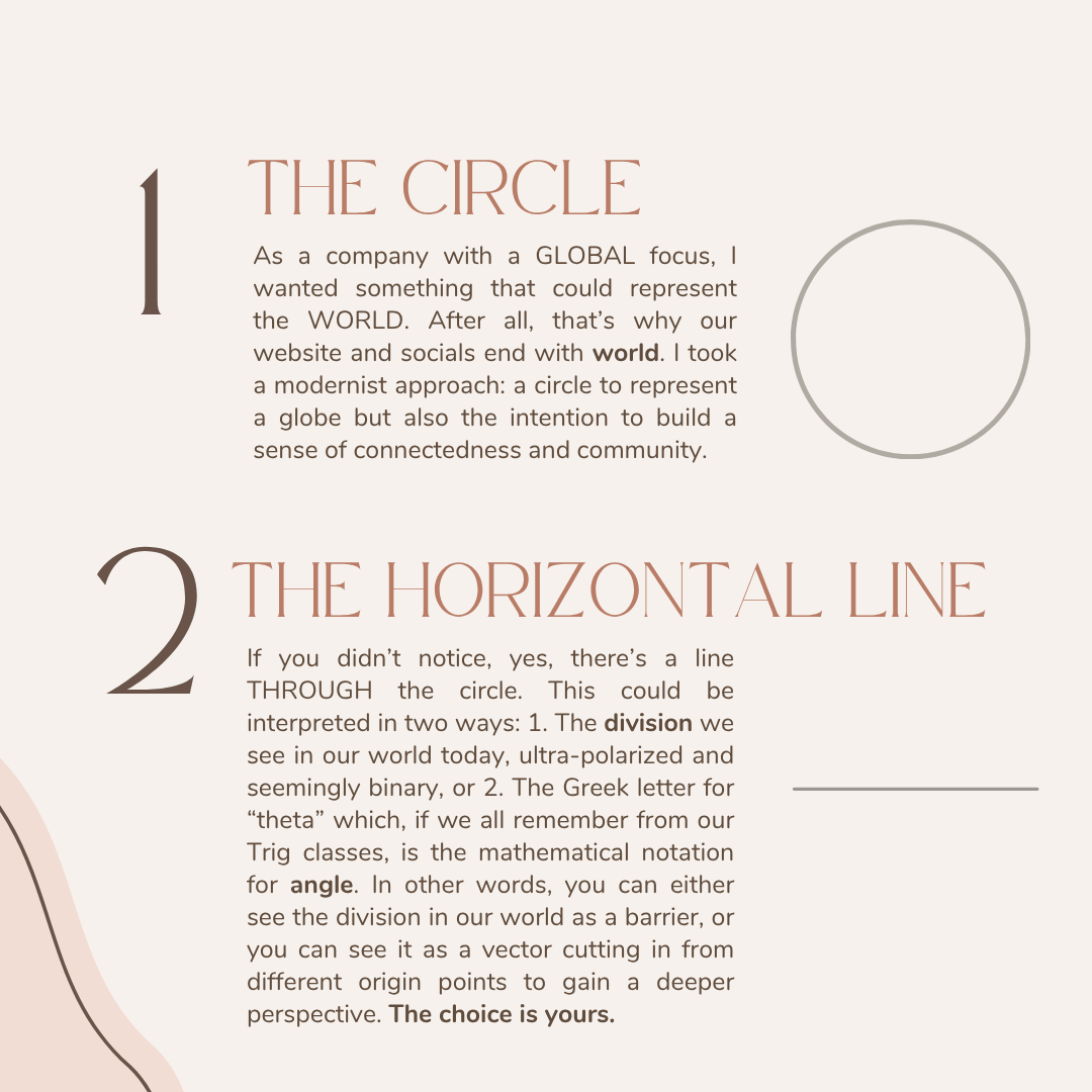
1. The Circle: A Global Perspective
WeCultivate is a company with a global focus. I wanted that to be clear in the design.
The circle represents the world, echoing why our website and social media handles end in “.world.”
But beyond that, it symbolizes connection and community — the core of what WeCultivate is about. Language and communication don’t exist in isolation; they thrive in relationships, networks, and shared spaces. The circle reflects that interconnectedness.
2. The Horizontal Line: Division or Perspective?
If you look closely, there’s a line cutting through the circle. This can be seen in two ways:
A symbol of division. Our world is increasingly polarized, with communication gaps that feel like barriers.
A reference to the Greek letter “theta” (θ). In mathematics, theta represents an angle, a way of measuring perspective. Instead of seeing division as an obstacle, we can see it as a vector, an opportunity to shift viewpoints and understand from new origins.
Which perspective do you choose?
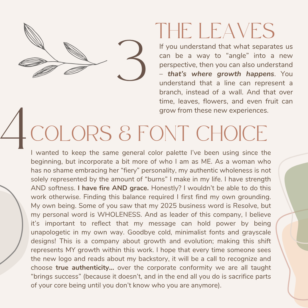
3. The Leaves: Growth Through Understanding
When we shift perspectives, growth happens. That’s where the leaves come in. They emerge from the line, symbolizing the idea that what may seem like a boundary or limitation can instead be a branch, leading to new opportunities. Over time, branches grow leaves, flowers, and even fruit—just as learning and understanding lead to deeper connections and meaningful change.
4. Colors & Font Choice: Strength, Softness, and Authenticity
The new logo keeps the core color palette I’ve used since the beginning, but with adjustments that reflect who I am—both as a professional and as a person.
I’m often described as “fiery”, but my strength isn’t just about boldness. It’s also about balance—fire and grace, power and softness. This logo refresh represents that wholeness.
Some of you may have seen my announcement on Instagram that my 2025 business word is Resolve. But my personal word is Wholeness. As the leader of WeCultivate, it’s essential that my brand reflects the same authenticity I encourage in my clients. That meant saying goodbye to cold, minimalist fonts and grayscale designs—because this is a company about growth and evolution, not rigid corporate conformity.
A Logo & Reminder. For Us All.
Every time someone sees the new WeCultivate logo, I want it to serve as a reminder: True success doesn’t come from fitting into a predefined mold. It comes from embracing who you are, evolving with purpose, and choosing authenticity over external expectations.
This rebrand isn’t just a design update—it’s a statement of growth, connection, and perspective. And I can’t wait to continue cultivating this journey with you.

